Search & Exploration – Browsing, Filtering, Finding
This is where WeChat's platform constraints hit hardest.
Students can browse properties in list or map view, apply filters, and dive into property and room detail pages. The core flow works. But getting here cost more redesign cycles than it should have — because I designed first and discovered platform limits after.
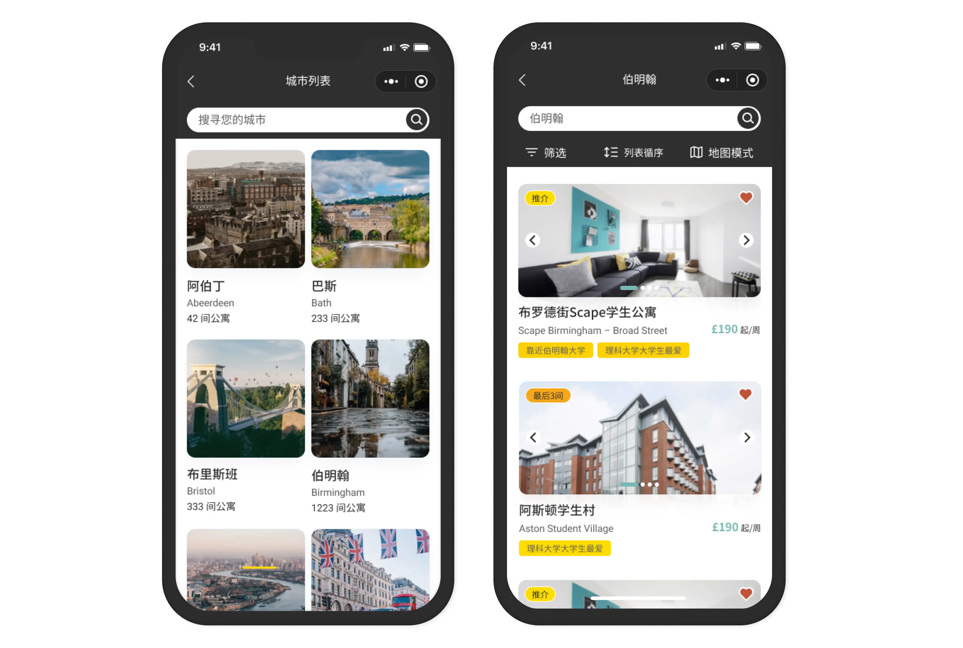
The Flow
Students arrive at Search after selecting a city. From here:
- List view
- Scrollable property cards with weekly pricing, photos, key highlights. Fast scanning.
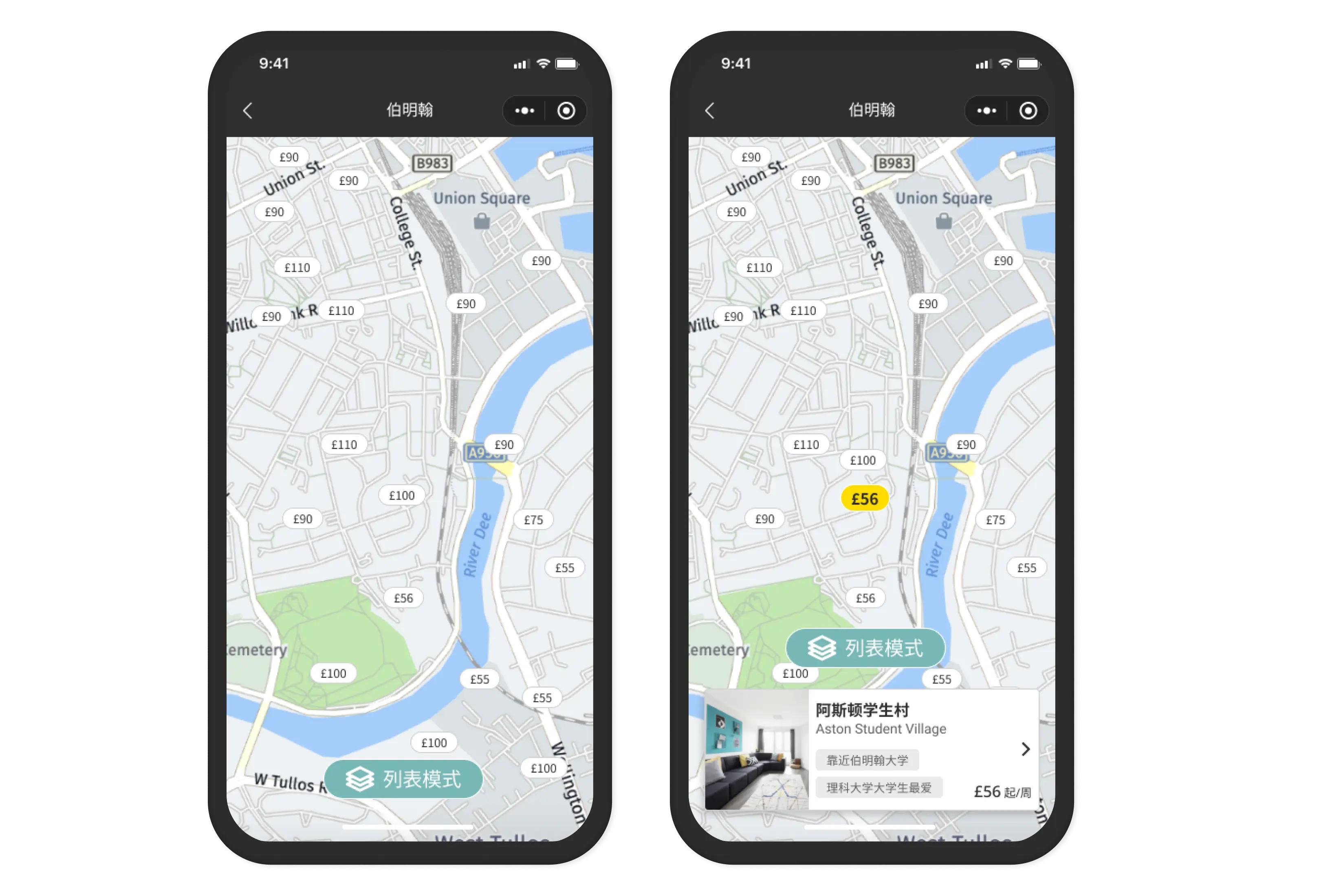
- Map view
- Properties as pins on a city map with pricing visible. Location context at a glance.
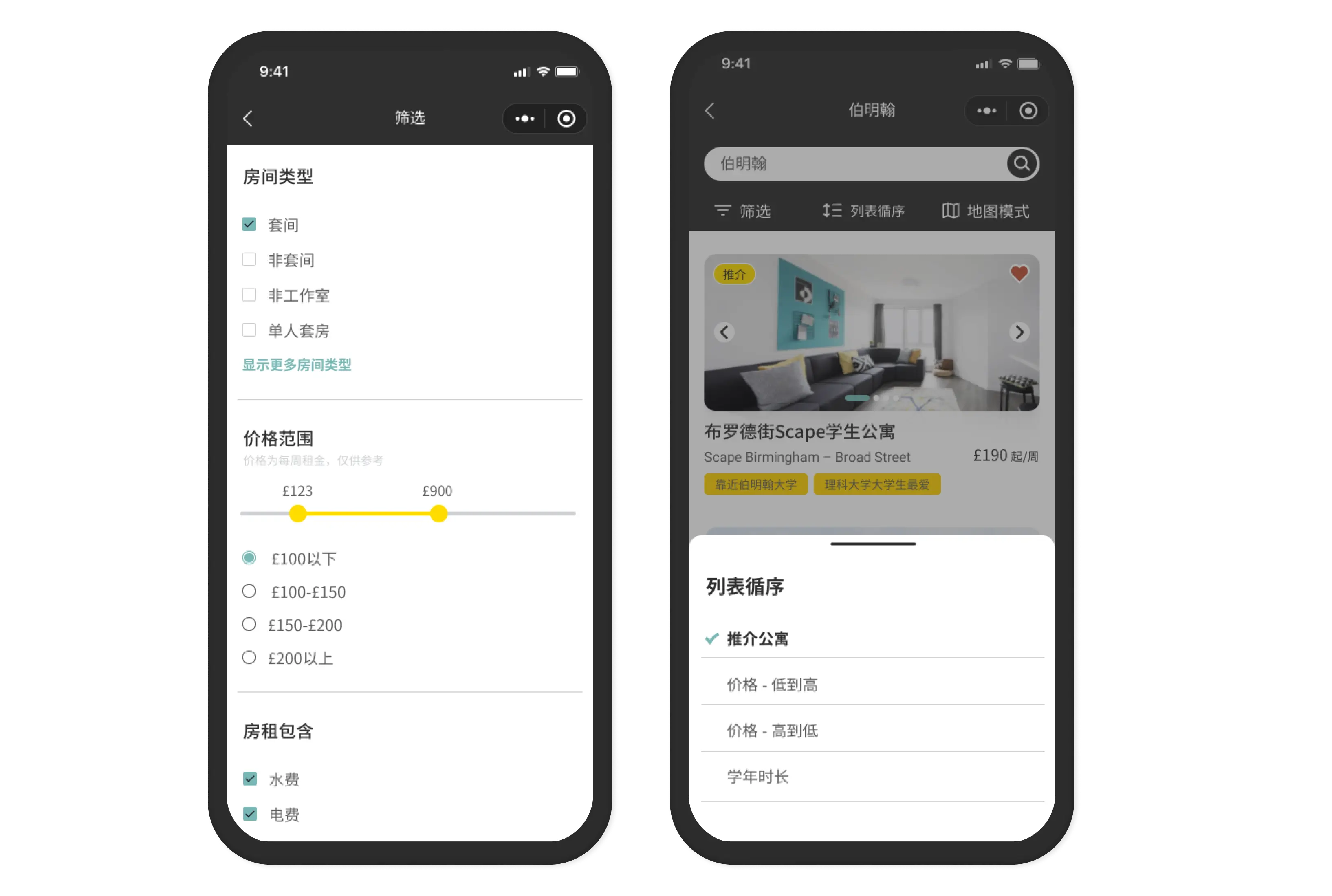
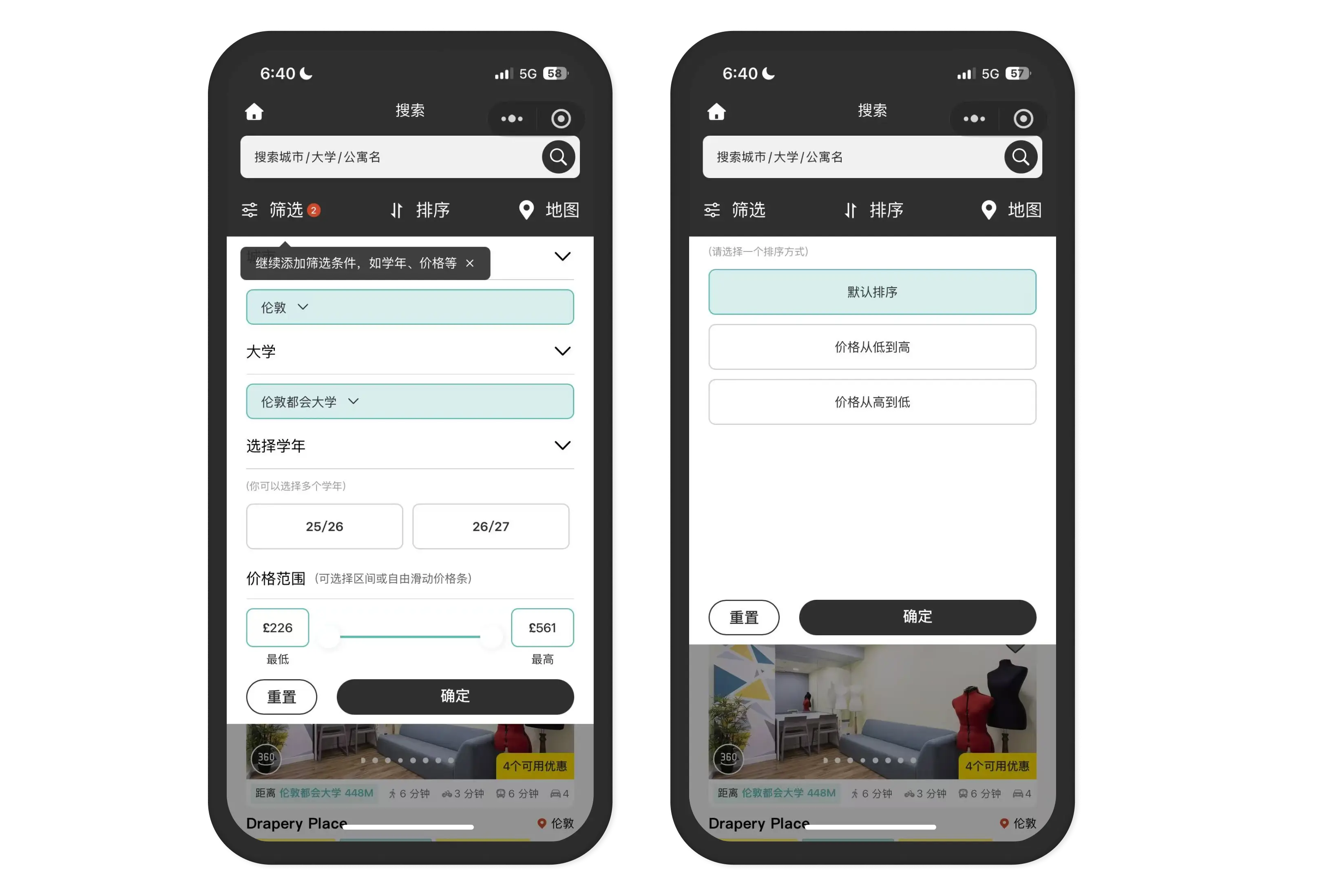
- Filters
- Room type, price range, facilities, tenancy length, distance to university, move-in date.
- Property detail
- Full property page — photos, description, amenities, nearby universities.
- Room detail
- Room types, pricing breakdown, tenancy options, availability.
The full journey: City → Search → Filter → Property → Room → Enquiry.
The Filter Problem (The Developer Story)
This is the most expensive mistake in the Mini Program.
I designed a custom filter modal. Clean UI, clear hierarchy, consistent with the overall design language. Looked great in Figma.
I handed it off.
The developer came back: "Cannot."
WeChat Mini Program has its own native picker component for certain UI patterns. The filter modal I designed wasn't buildable as designed — WeChat enforces its own scroll-picker for dropdowns. He knew this. He didn't tell me before I designed it.
What happened next
- Redesign cycle mid-project
- The developer implemented a hybrid — some native WeChat components, some custom
- Visual consistency between filter and the rest of the app: inconsistent
- Tap targets, spacing, visual treatment: all slightly off from design
- What it cost
- 2 weeks of back-and-forth redesign. A filter that works but doesn't feel fully native OR fully custom — it's stuck in between.
- What should've happened
- Before designing filters, one question: "What are the WeChat component constraints for modals and pickers?" He would've told me. He just didn't think to volunteer it.
Map View — What Worked
The map view was the one feature I wasn't sure about. International students unfamiliar with UK cities — would they even use a map?
Post-launch: yes. Students used map view specifically to check proximity to universities. The ability to see "this property is 10 minutes from my campus" was a real decision-making moment.
Properties as pins with pricing visible upfront — not hidden until you tap — was the right call. Students could eliminate expensive areas without opening every listing.
This worked because the problem was clear: International students don't know UK city geography. A map with pricing solves that directly.
Property & Room Detail — The Trust Layer
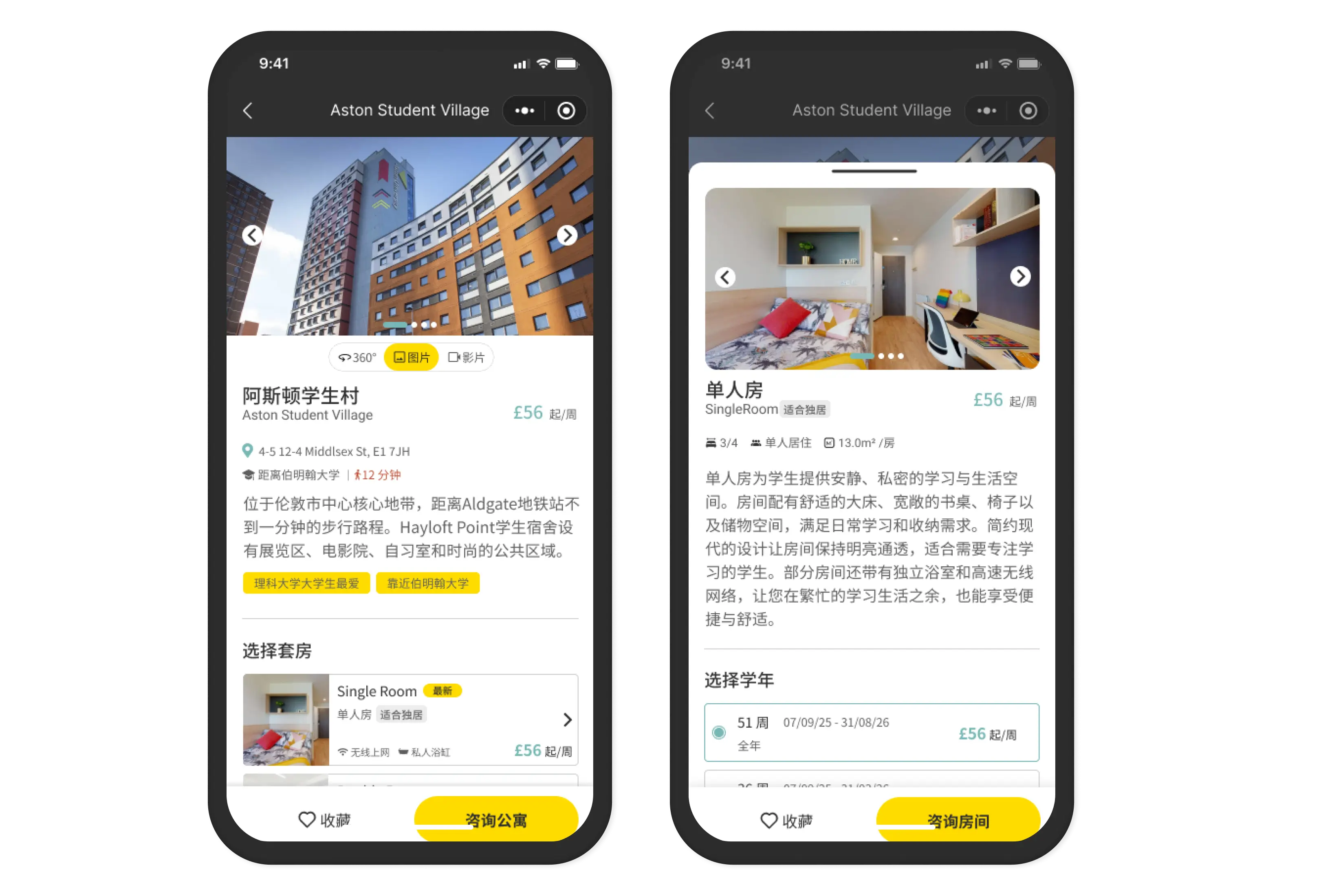
Property detail pages had to do a lot: photos, description, amenities, nearby universities, distance markers.
Room detail pages had to do even more: room type name, weekly pricing, tenancy length options (26 or 52 weeks aligned to academic calendar), availability, inclusions (bills, wifi, etc).
- What worked
- Tenancy length tied to academic calendar was a small but significant decision. "26 weeks" means nothing. "September start, aligned to your academic year" means something. Framing it around the student's actual situation reduced a common point of confusion.
- What the developer changed
- Room detail layout. He reorganized the information hierarchy without telling me — price moved to a different position, tenancy options displayed differently. Caught it in QA.
The Lesson
Design within platform constraints, not against them.
WeChat Mini Program is not a web app. It has native components, enforced patterns, and interaction limits that don't exist in Figma. Designing without knowing those limits = expensive rework.
What I'd do differently
Before any new platform: spend a week mapping what's possible.
- What components are native? (Pickers, modals, tabs, navigation)
- What interactions are unsupported?
- What patterns does the platform enforce?
Then design within that reality.
Not the other way around.
The Gap I'm Closing
Search & Exploration works. Students browse, filter, find rooms. The core journey functions.
But it carries the cost of discovering constraints mid-build. A filter that's half native, half custom. A room detail layout that differs from the Figma spec. Small inconsistencies that add up.
The pattern is the same as Dashboard, the same as Properties: decisions made without enough upfront information. Post-hoc fixes are expensive.
The discipline I'm building: ask the hard questions before designing. Not after.